

Grades 7-10 Math: Creating Graphs in MS Excel
Upon opening the economic database, it should look like this:
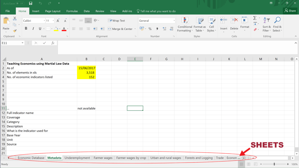
The tabs at the bottom of the spreadsheet are called “sheets”.
Then, click the first sheet labelled “Economic Database”
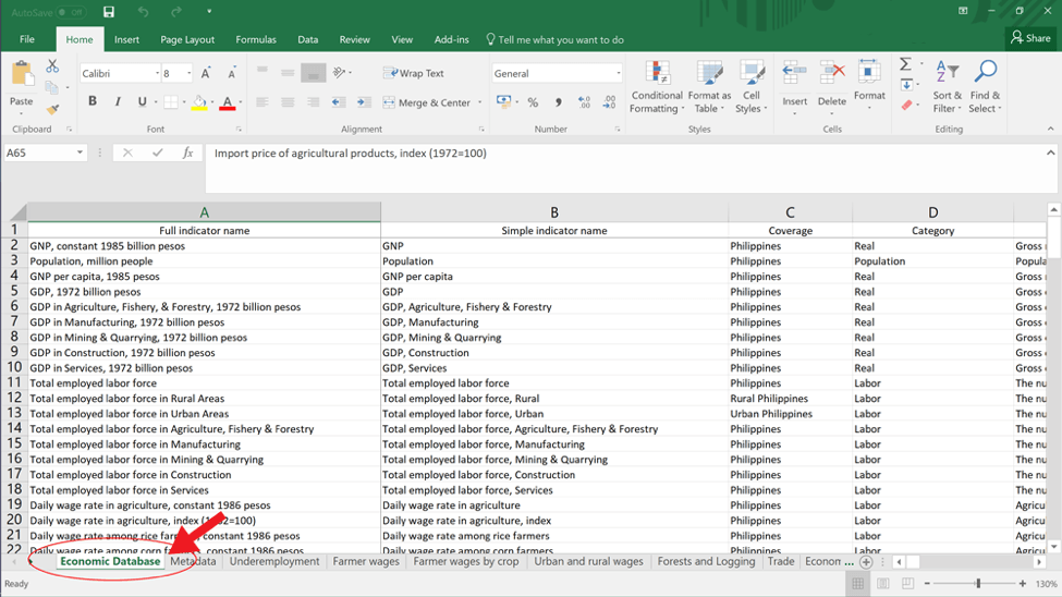
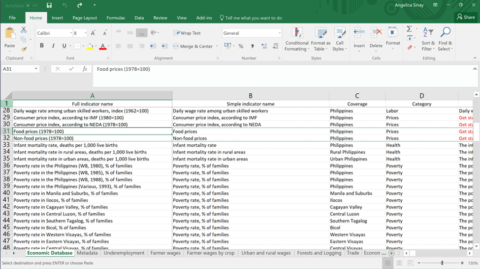
Locate the chosen economic indicator from the first column labelled “Full indicator name”
-
- For example, let’s graph the Food prices and Non-food prices during the regime. To find this, you might need to scroll down the file.
The row for the chosen economic indicator should have the data you’ll need! Check out the cells to its right to see the data.
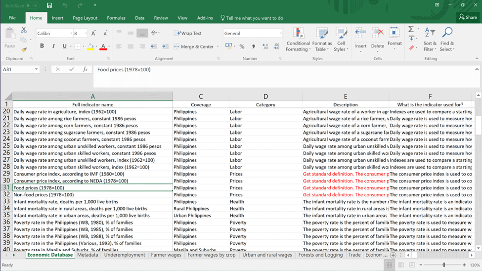
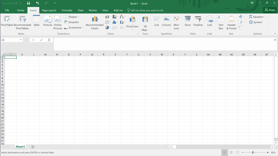
Click the number of the first row and the rows of your chosen indicator while holding the Ctrl button.
Copy the rows then paste it onto a new spreadsheet.
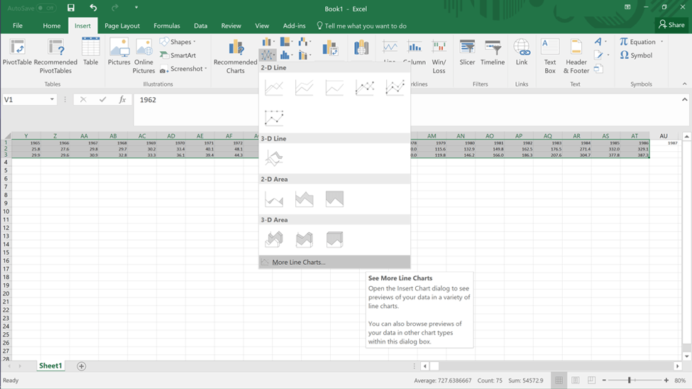
To create a graph on MS Excel, you can choose graphs from the Chart area under the Insert tab.
- Highlight the data points you wish to graph then choose which chart you want to use
Try and experiment with the different graphs available!
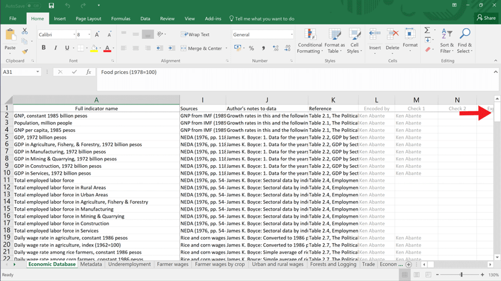
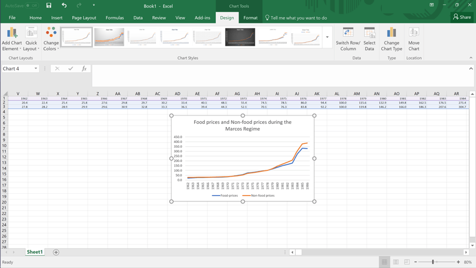
Don’t forget to label the chart and the axes! Also remember to cite the source wherever you intend to use this graph. (The sources and the author’s notes are also in the economic database.)
Here are the basic elements of a chart:
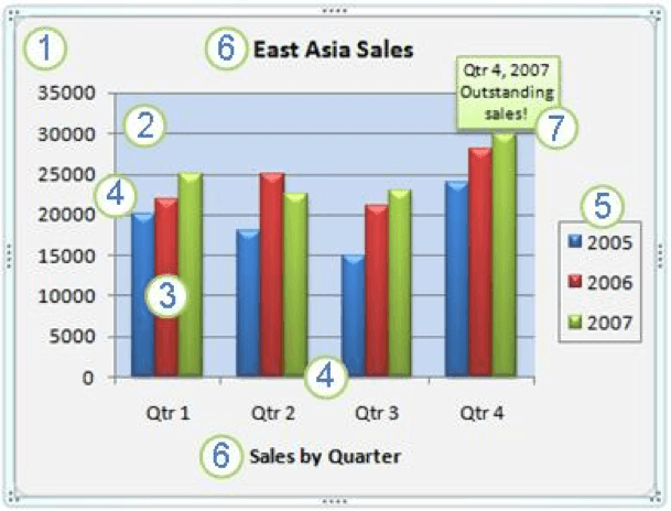
- Chart Area
- Plot Area
- Data points plotted
- Horizontal and Vertical Axes
- Legend
- Chart and Axis Title
- Data label
Source: Microsoft Support
Aside from these, you can also change the style of your chart, change the layout of the elements manually, add and remove titles and data labels, show or hide legends, display or hide gridlines, and more! Visit the Microsoft Support Page referenced below for a more detailed account of creating and editing graphs.