Grades 4-6 Math: Reading Graphs

ESSENTIAL QUESTIONS
- What is the importance of reading graphs and tables?
- How do we effectively read a graph and tables?
MODULE OBJECTIVES
After successful completion of the module, the student should be able
- To explain the importance of reading graphs and tables
- Identify the main information conveyed by graphs and tables

Concepts
READING GRAPHS AND TABLES
Data is often presented in the form of graphs and tables in order to summarize and communicate a wide range of information. An effective graph or table is able to convey the most important features of selected data completely, accurately, fairly, and with relative ease. Because graphs and tables are so useful and ubiquitous in today’s world, it is important to know how to read them.
FORMS OF DATA PRESENTATION
A. Textual
Data presented in the textual form is merely data enumerated through a written account. It is a combination of texts and figures written in paragraph form.
Example:
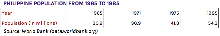
“According to the data gathered from the World Bank in data.worldbank.org, the entire Philippine population during the year 1965 was 30.9 million people. In 1971, it was 36.9 million people. In 1975, it was 41.3 million people. In 1985, it was 54.3 million people.”
B. Tabular
Data presented in the tabular form is data arranged within tables: through rows and columns.
Example:
C. Graphical
The graphical form serves as visual representation of data for easier interpretation between its proportions and relationships. This only highlights essential information from data, without having to present all of the elements.
Line graph
In line graphs, data are represented by coordinate points joined by line segments over a coordinate plane. The horizontal axis is usually the time axis, while the vertical axis is another quantity. Line graphs usually show the change in one quantity over the change in another.
Bar Graph and Histogram
In bar graphs, data are represented by rectangular bars of different heights to represent the magnitude of each datum. This graph is usually used to emphasize comparisons between data. It may be vertical or horizontal. Histograms are similar to bar graphs but with numbers grouped into ranges. In graphing histograms, it is not necessary to put spaces in between bar graphs.

Pie Graph
Pie graphs represent data in the form in a pie-shaped graph with each “pie slice” as the percent distribution of each datum. The pie is divided into sections proportional to the magnitudes of data these represent. Pie graphs visually represent data to show sizes of each datum relative to other data in the set.
Pictograph
Similar to a bar graph, pictographs present data through pictures that represent specific quantities, usually plotted with horizontal and vertical axes.
![]()
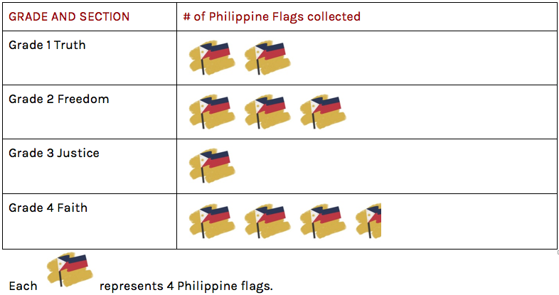
For Linggo ng Wika, one class from each of four batches was tasked to look for as many Philippine flags as they can. Below are the results of the inter-batch competition:
PARTS OF A GRAPH AND ITS FUNCTIONS
Some parts of graphs useful to know are:
- Range: this is the difference between the maximum and minimum data plotted
- Mode: this is the most frequent datum (or data) plotted
AN ERRONEOUS GRAPH AND ITS POTENTIAL TO MISLEAD
Because graphing more often than not utilizes only a portion of the data collected, some graphs, when not properly constructed, may mislead or give a false impression. Here are some ways graph can be erroneous and potentially mislead:
- When parts of the graph are omitted or not included
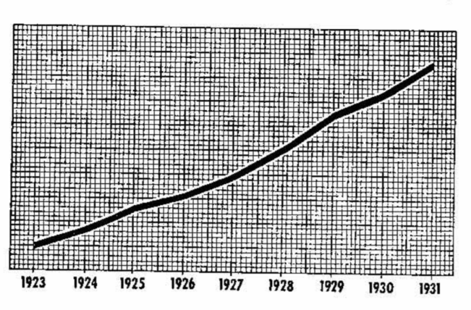
- Because the graph below does not have a label for its vertical axis, it becomes impossible to read.
- Choosing what to exclude from the graph and how this changes the impression it gives.
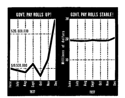
- The example below cuts a significant amount from the vertical axis. This gives off the impression that the change in the data is more than it actually is. The line graph on the right is a more accurate representation of the data.
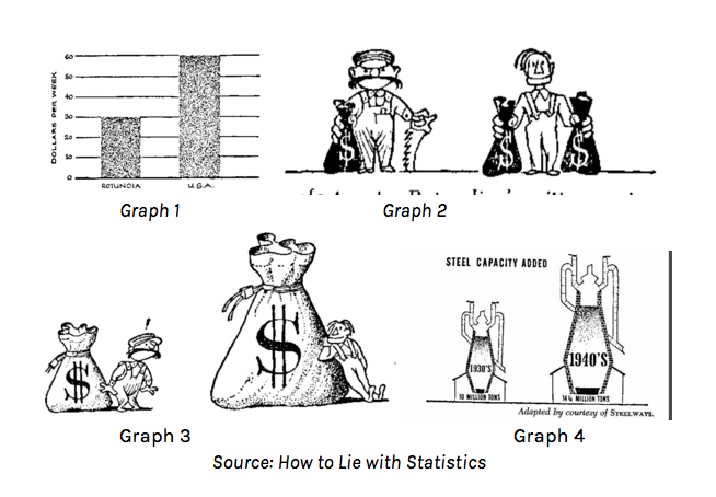
- Misleading pictographs
- Actual Ratio vs. Visual Impression: Pictographs that utilize three-dimensional symbols can sometimes give the impression that the proportion is greater than it actually is. Proportion is usually expressed in pictographs through differences in length (like the Graph 1) or with the same symbols but with differences in quantity (like Graph 2). However, pictures cannot simply be “enlarged” like Graph 3 and Graph 4 below. This is because increasing a three-dimensional object’s height also increases its width, and depth — effectively multiplying the visual impression it leaves more than supposed.
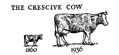
- Inappropriate picture choice: Some visual representations of data may be taken too literally by those unfamiliar with pictographs. The examples below may cause people to think that cows have become larger in 1936 than in 1860.